To design an effective dashboard as a UI/UX designer, prioritise key information, use a clean layout with readable typography and colours, incorporate interactive elements, and gather user feedback for refinement.
Tealive

Company: Loob Holding
Project: Tealive App Redesign
Role: Lead UI/UX Designer
Software: Figma, and FigJam
Type: Mobile App Redesign
Platform: iOS / Android
Cooperate with: Artisan
Project: Tealive App Redesign
Role: Lead UI/UX Designer
Software: Figma, and FigJam
Type: Mobile App Redesign
Platform: iOS / Android
Cooperate with: Artisan
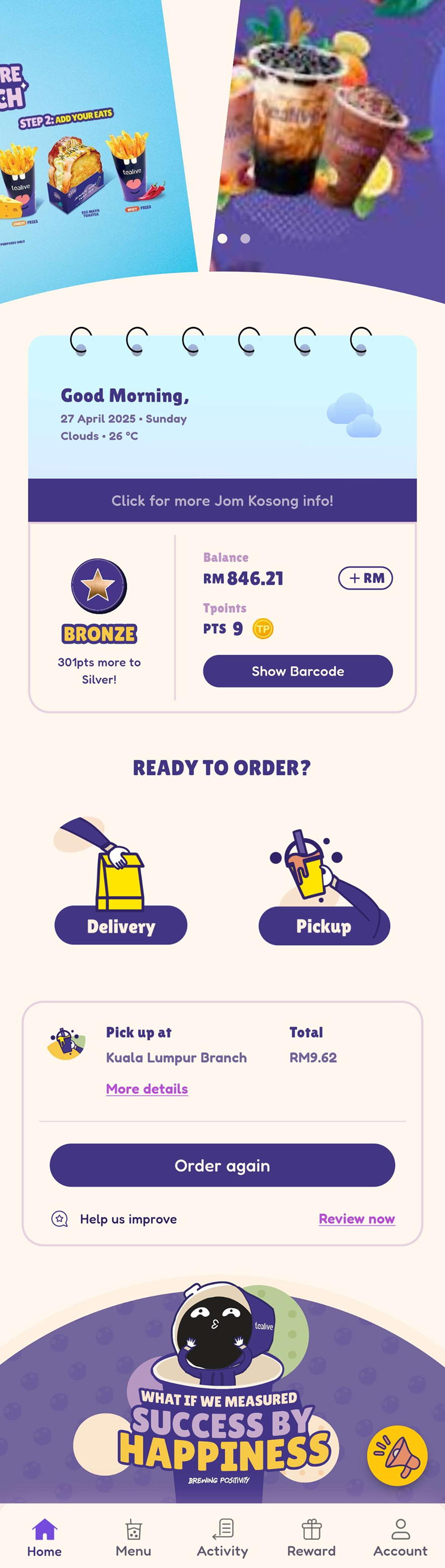
Download Now For Free At
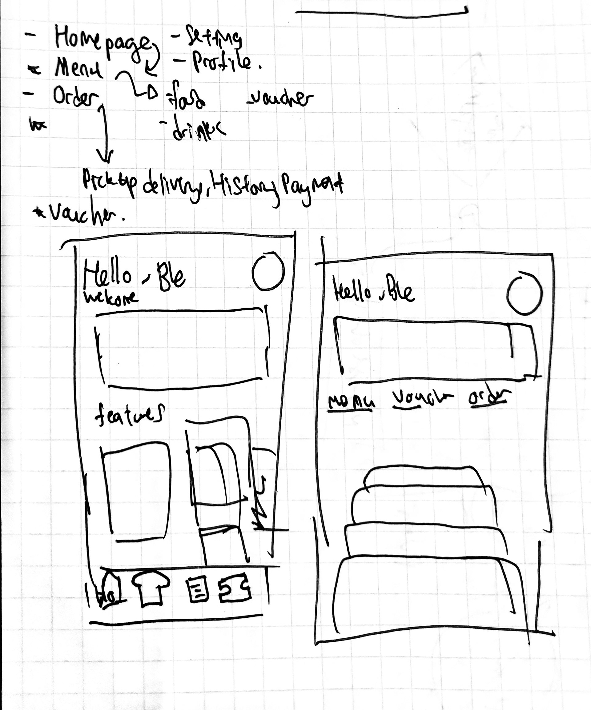
Project Overview
Tealive is Malaysia’s #1 lifestyle tea brand with millions of app users. As the lead UI/UX designer at Loob Holding, I was tasked to redefine the mobile experience to better align with Gen Z expectations, increase customer engagement, and streamline core functionalities such as ordering, rewards, and gamification.
This redesign focused on modernising the visual language, optimising key user flows, and integrating interactive features that convert daily visits into repeat purchases.
Challenges
- Outdated UI lacking brand identity and mobile responsiveness
- Fragmented user flows with high drop-off during checkout
- Low engagement with existing rewards and gamification elements
- Difficulty navigating and discovering new promos or seasonal items
- Fragmented user flows with high drop-off during checkout
- Low engagement with existing rewards and gamification elements
- Difficulty navigating and discovering new promos or seasonal items
Comparison Before and after (Homepage and Menu)
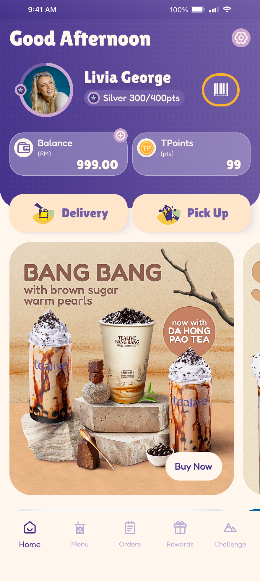
Homepage (Before)
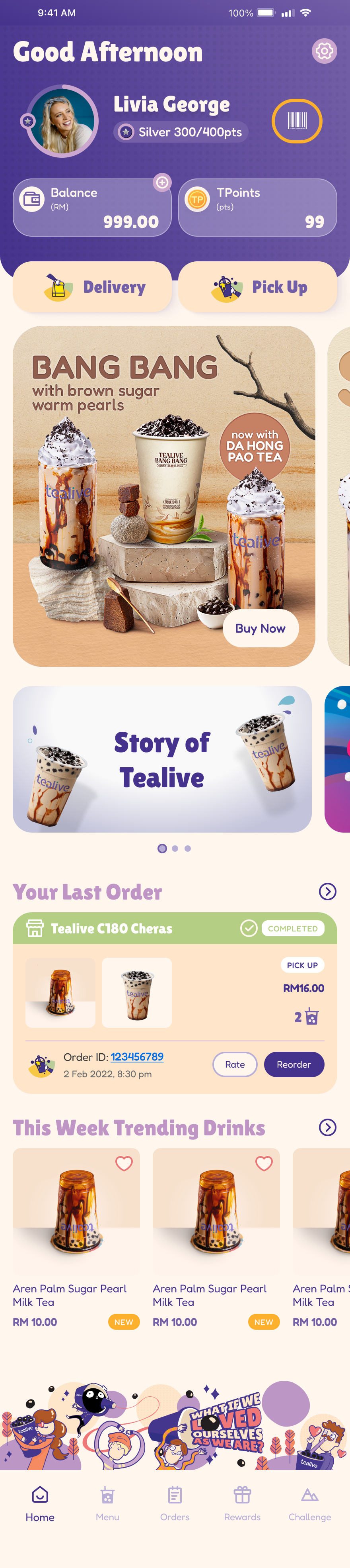
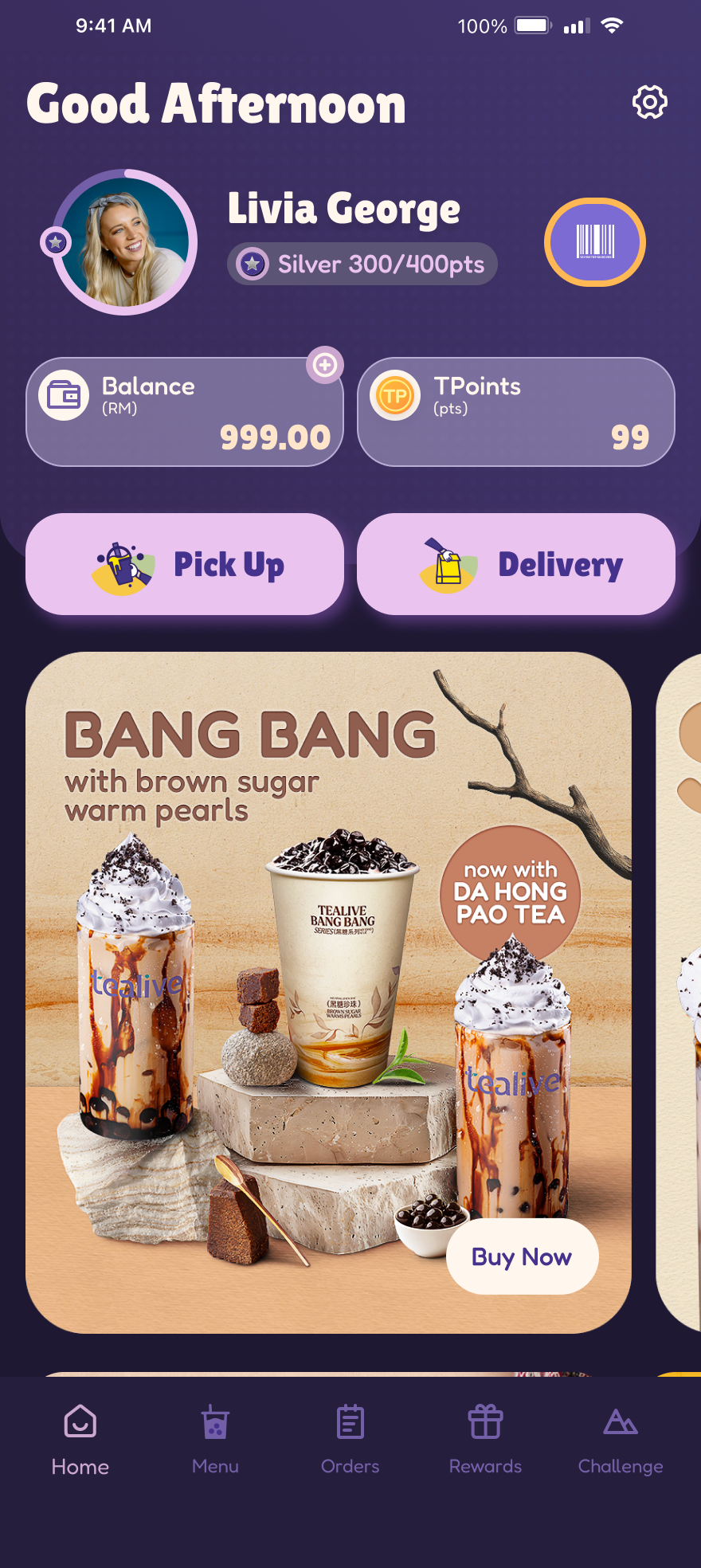
Homepage (After)
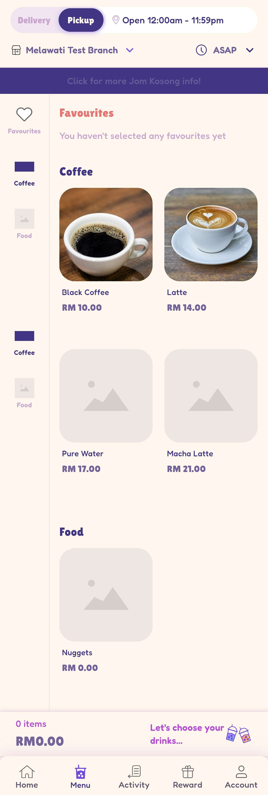
Menu (Before)
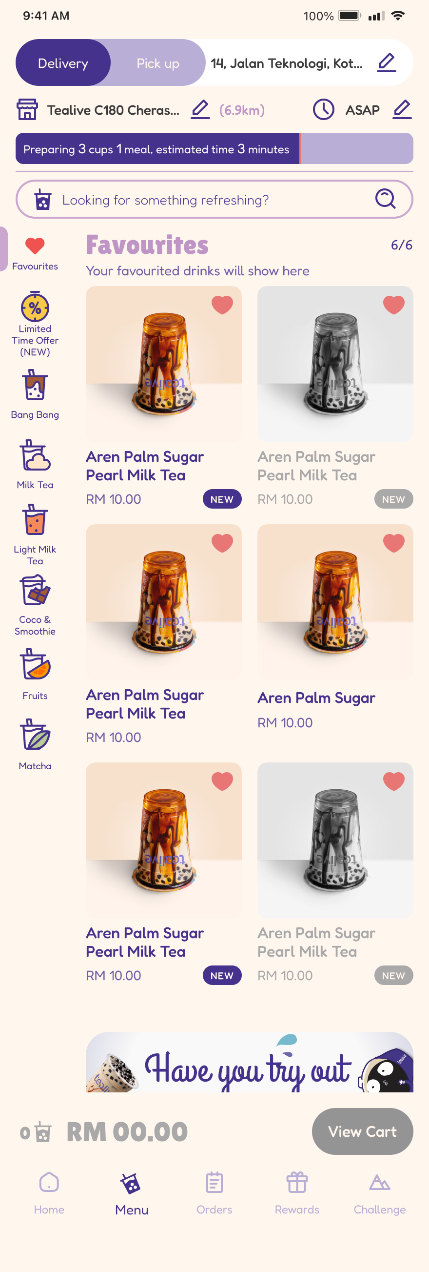
Menu (After)
Light Mode and Dark Mode
Homepage (Light Mode)
Homepage (Dark Mode)
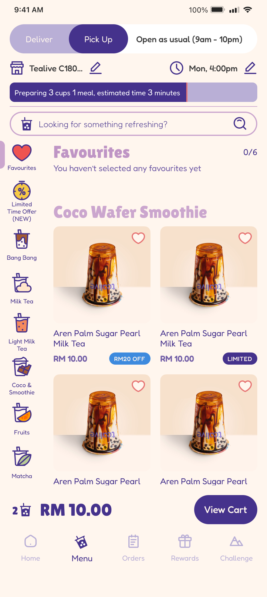
Menu
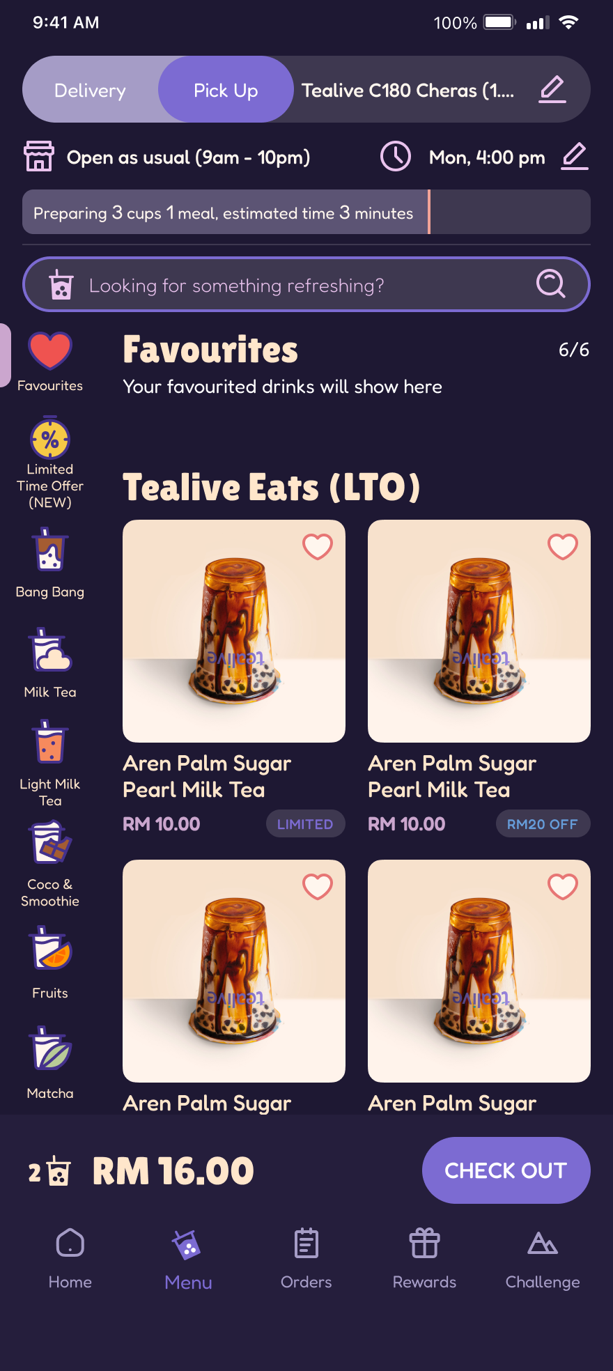
Menu (Dark Mode)
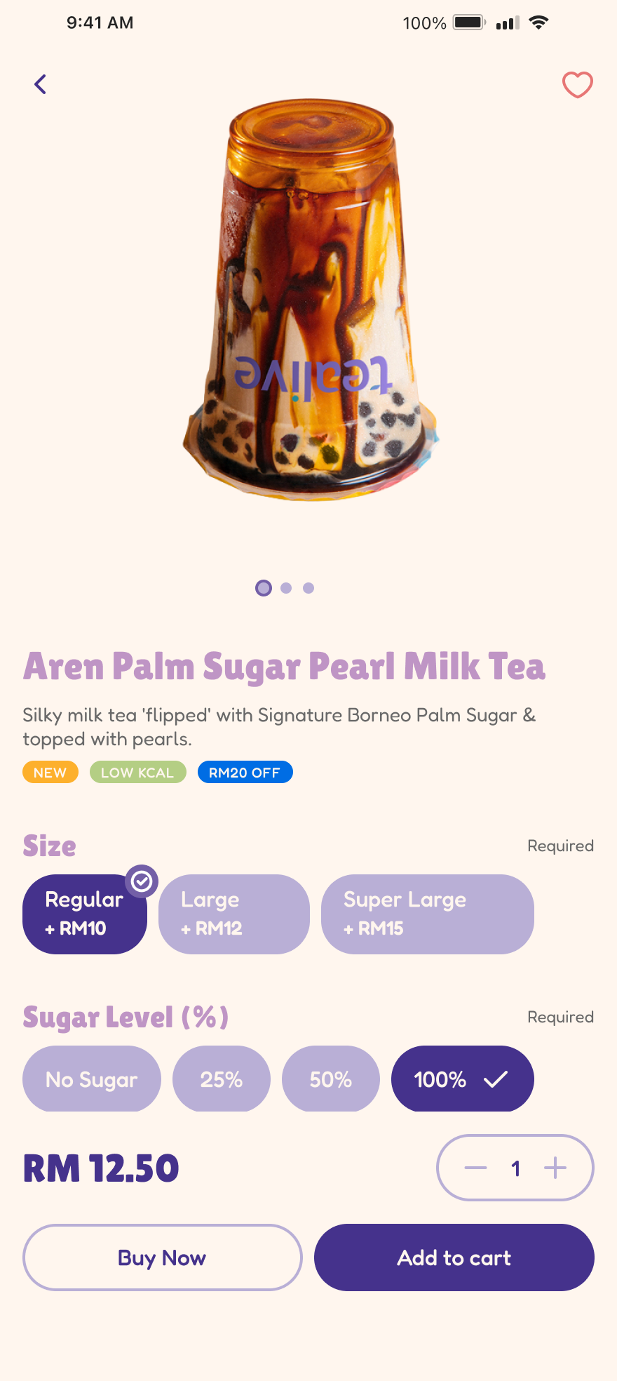
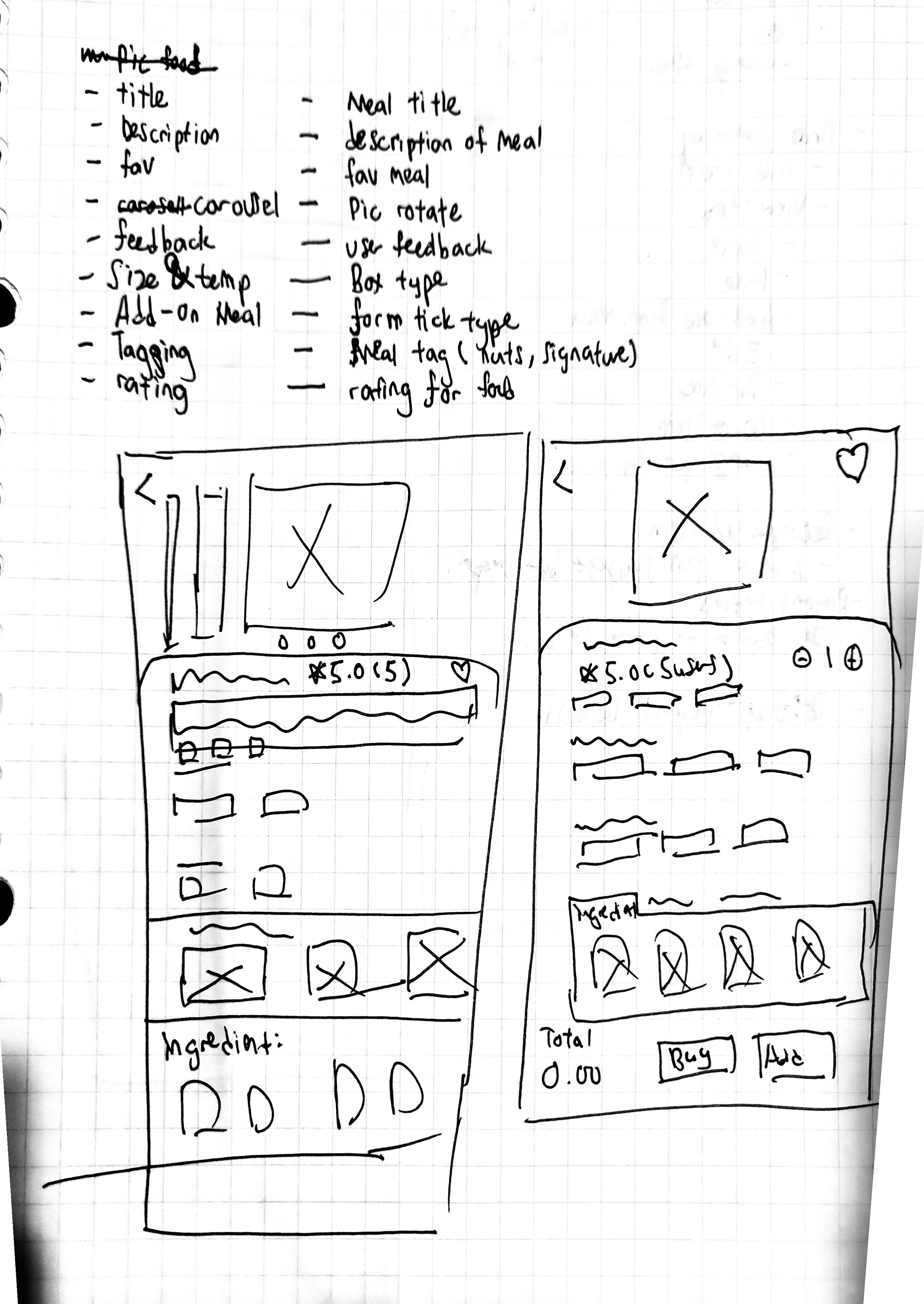
Item Detail (Light Mode)
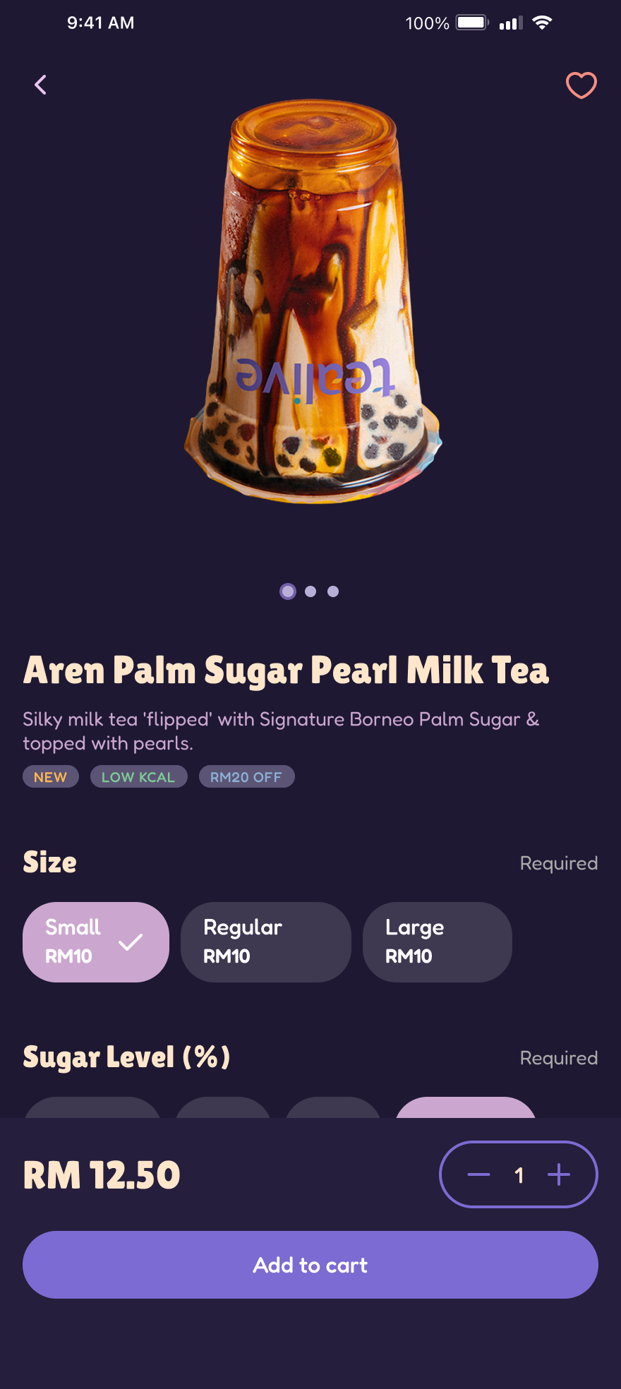
Item Detail (Dark Mode)
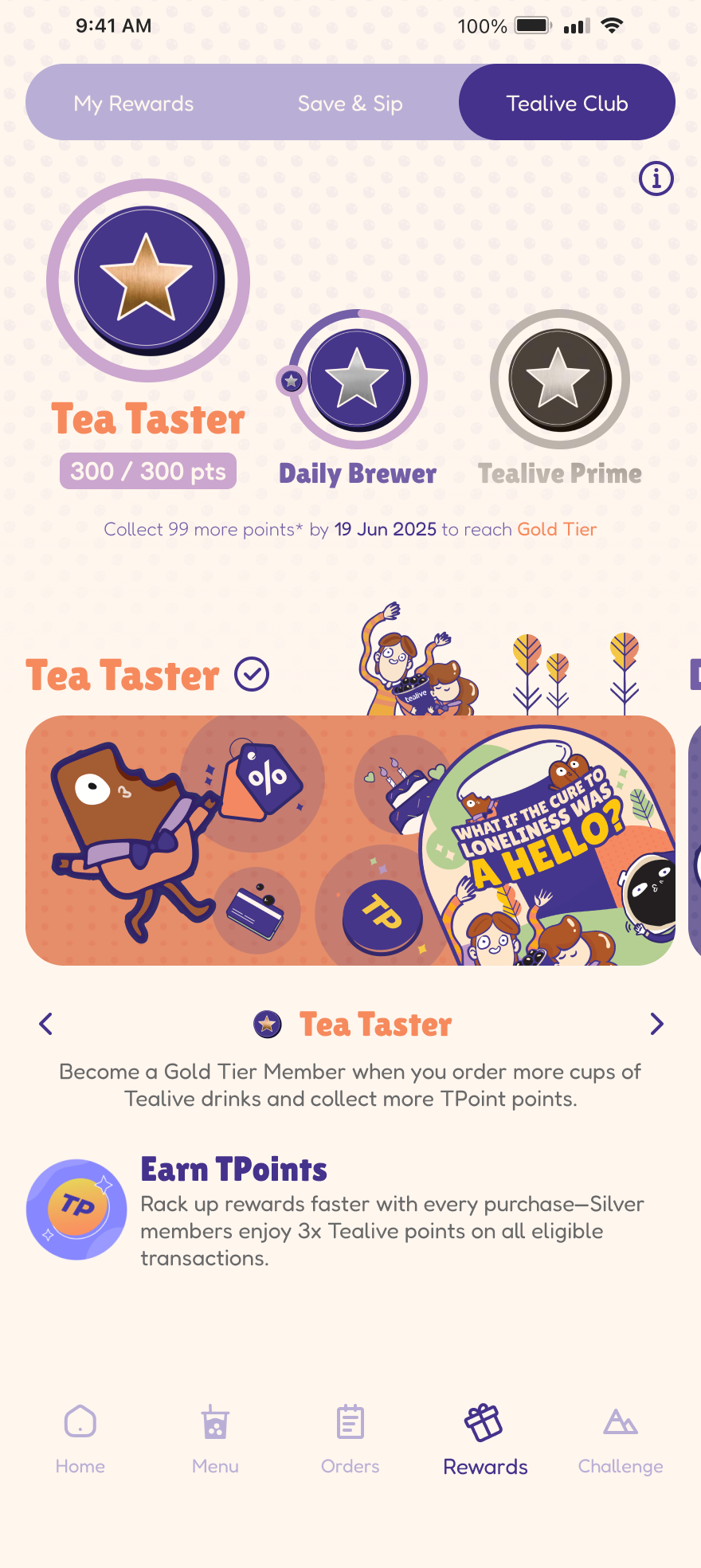
Tealive Club (Light Mode)
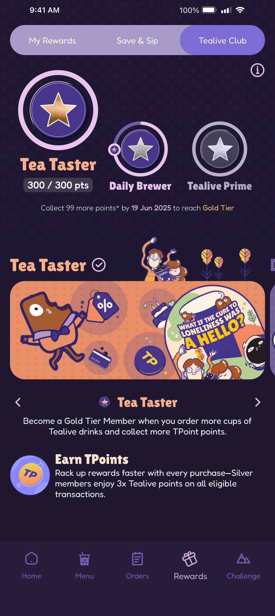
Tealive Club (Dark Mode)
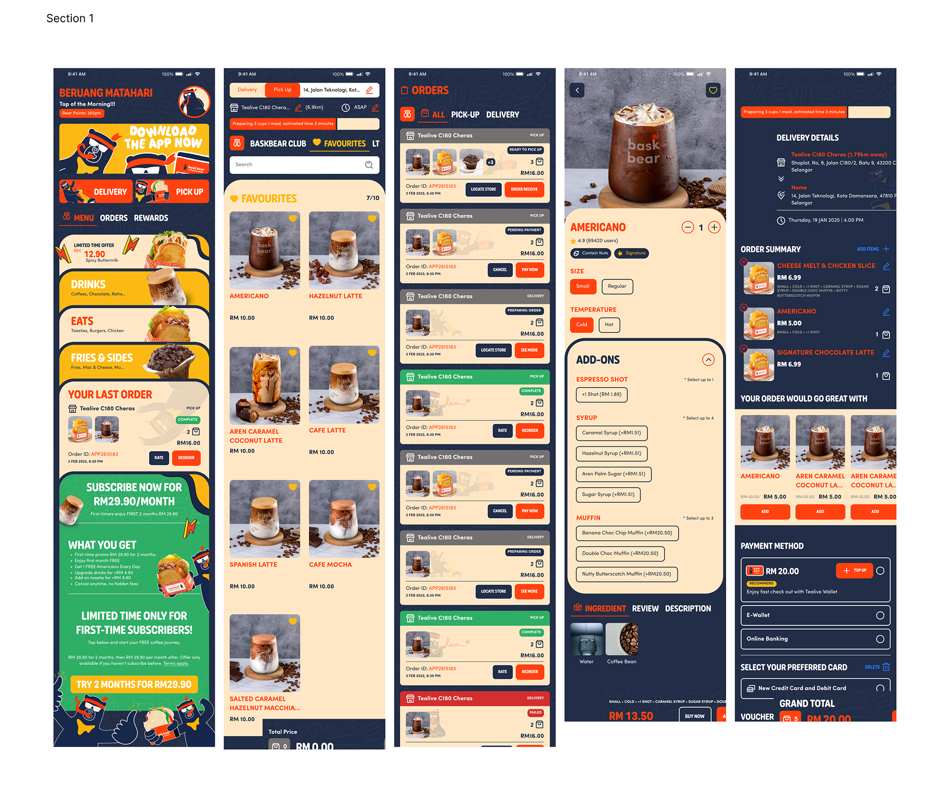
Overview of New Tealive app design
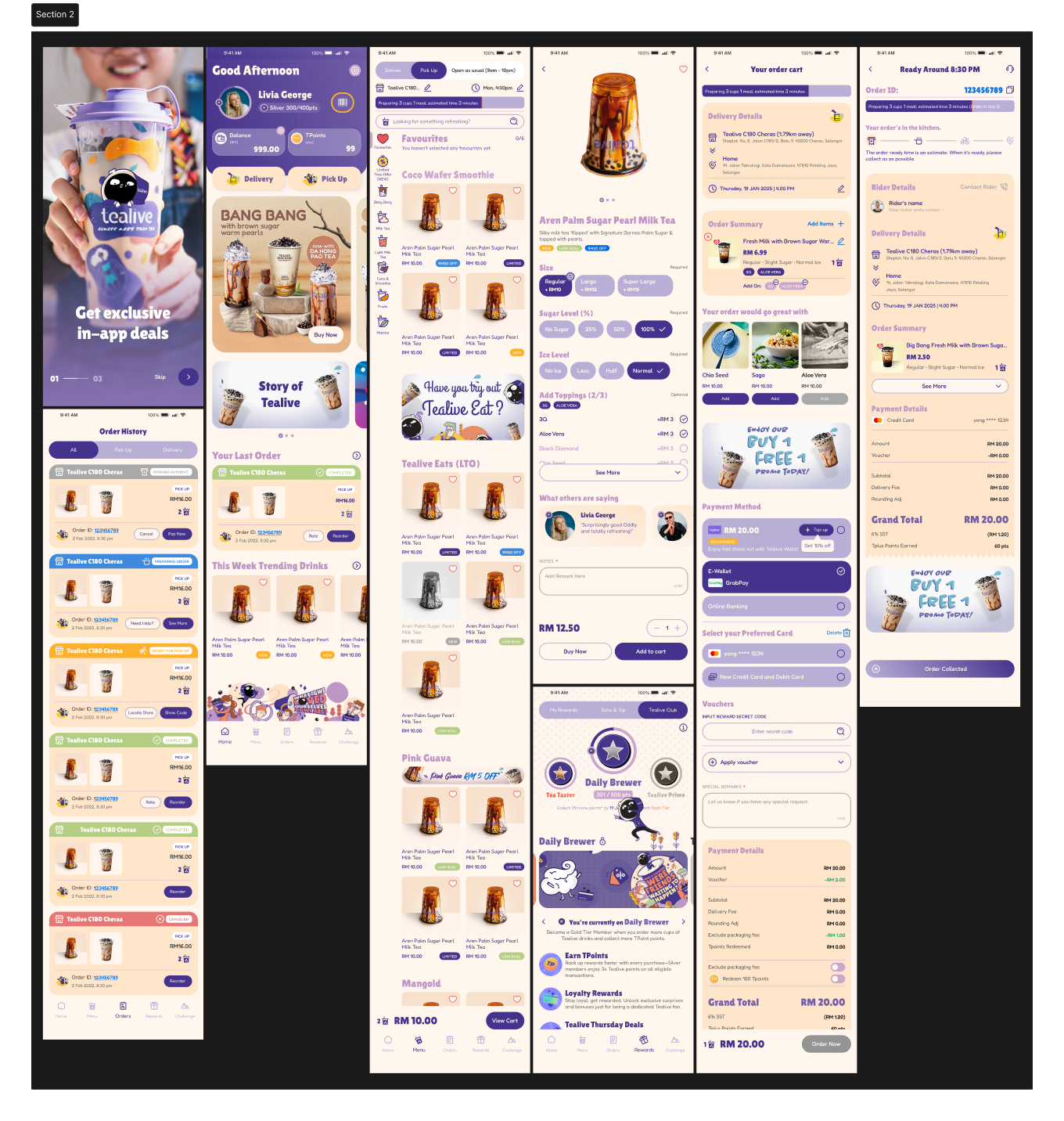
Optimising the Group Ordering User Journey for Drink & Food Selection in the Tealive App
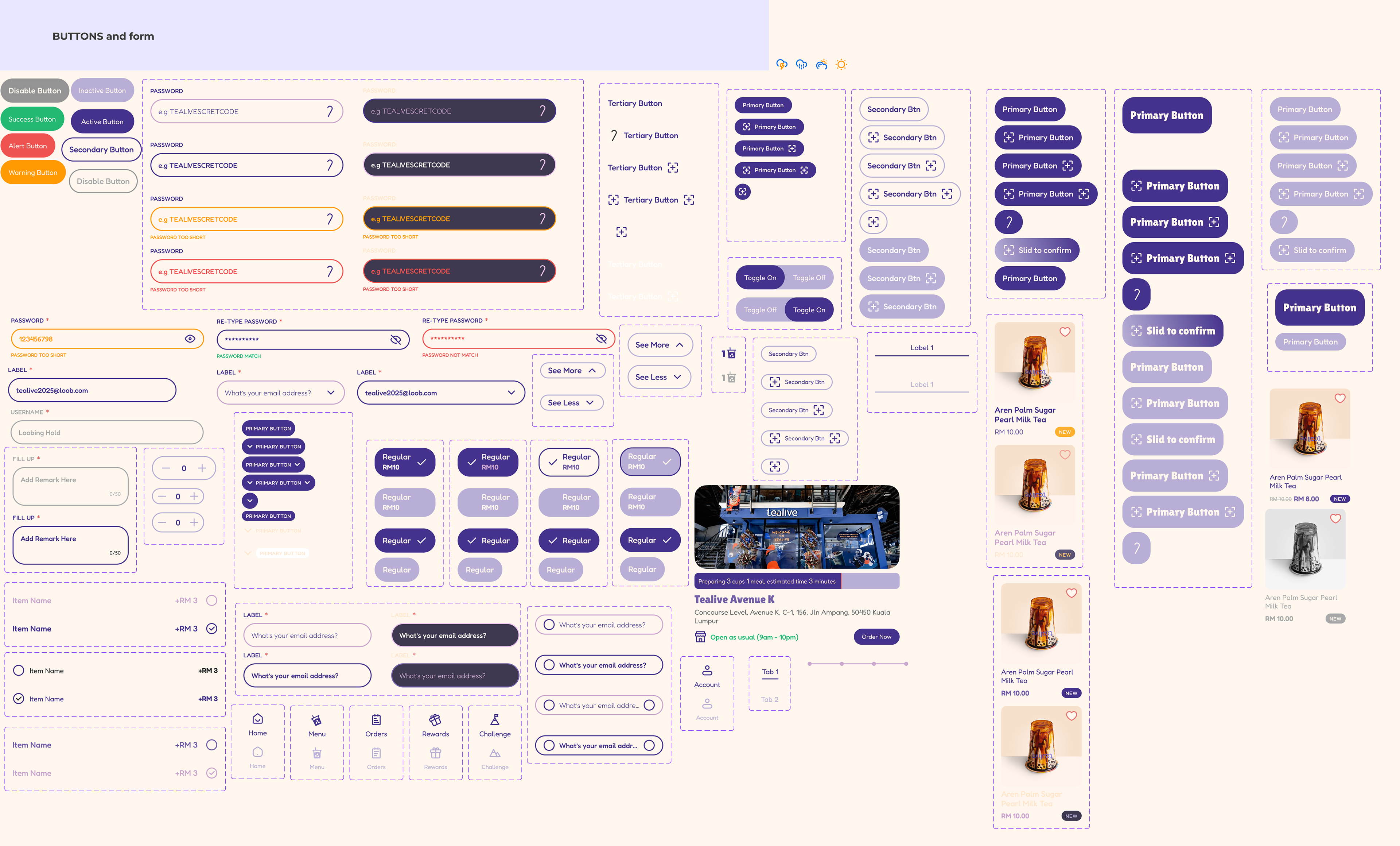
Tealive UI Mixed Component
Bask Bear Coffee

Company: Loob Holding
Project: BaskBear App Redesign
Role: Lead UI/UX Designer
Software: Figma, and FigJam
Type: Mobile App Redesign
Platform: iOS / Android
Cooperate with: Artisan
Project: BaskBear App Redesign
Role: Lead UI/UX Designer
Software: Figma, and FigJam
Type: Mobile App Redesign
Platform: iOS / Android
Cooperate with: Artisan
Download Now For Free At
Project Overview
Baskbear Coffee is a fast-growing Malaysian coffee brand under Loob Holding, focused on delivering bold brews through a digital-first experience. As part of the mobile product redesign initiative, I was responsible for refreshing the app’s core user interface, simplifying the ordering journey, and optimising usability across devices.
The objective was to transform the app from a functional tool into an emotionally engaging, brand-aligned platform that supports everyday ordering and seasonal campaigns
Aplikasi Bask Bear Kini Diperbaharui Dengan Reka Bentuk Lebih Moden Dan Pintar
Jenama kopi tempatan Bask Bear Coffee memperkenalkan versi terbaharu aplikasi mudah alih mereka dengan peningkatan menyeluruh dari segi prestasi, reka bentuk dan fungsi digital.
Why We’re Redesigning
The previous Baskbear app served its functional purpose but lacked emotional connection and distinctiveness in a saturated market.
Outdated Visuals: The UI felt dated and did not reflect the evolving direction of the Baskbear brand.
No Brand Soul: There was minimal expression of Baskbear’s identity — its bold personality and mascot were nearly absent from the digital experience.
Generic UI: Visually and structurally, the app mirrored competitors like ZUS, Chagee, and Beutea — creating brand confusion instead of brand recall.
Flat Engagement & Retention: With limited personalisation and poor onboarding, user activity metrics were stagnant.
Comparison Before (Left) and After (Right)
Homepage (Before)
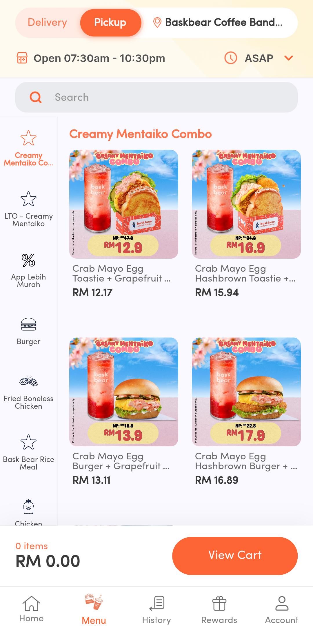
Homepage (After)
Menu page (Before)
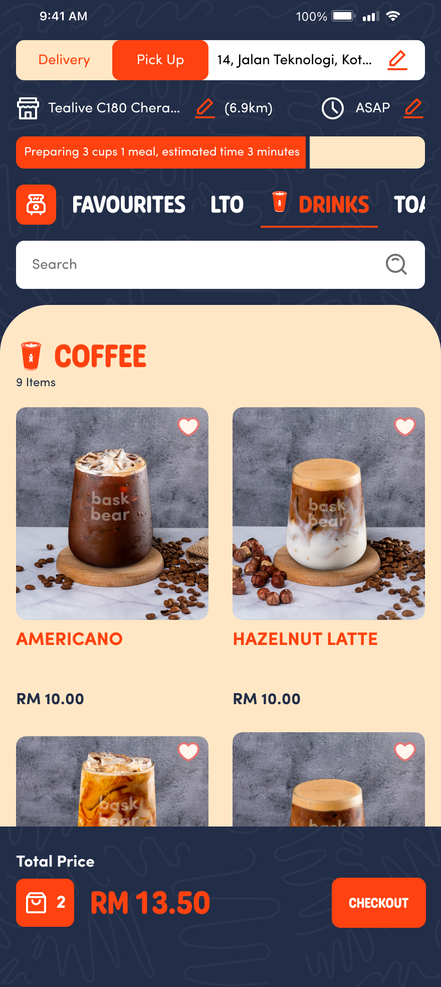
Menu page (After)
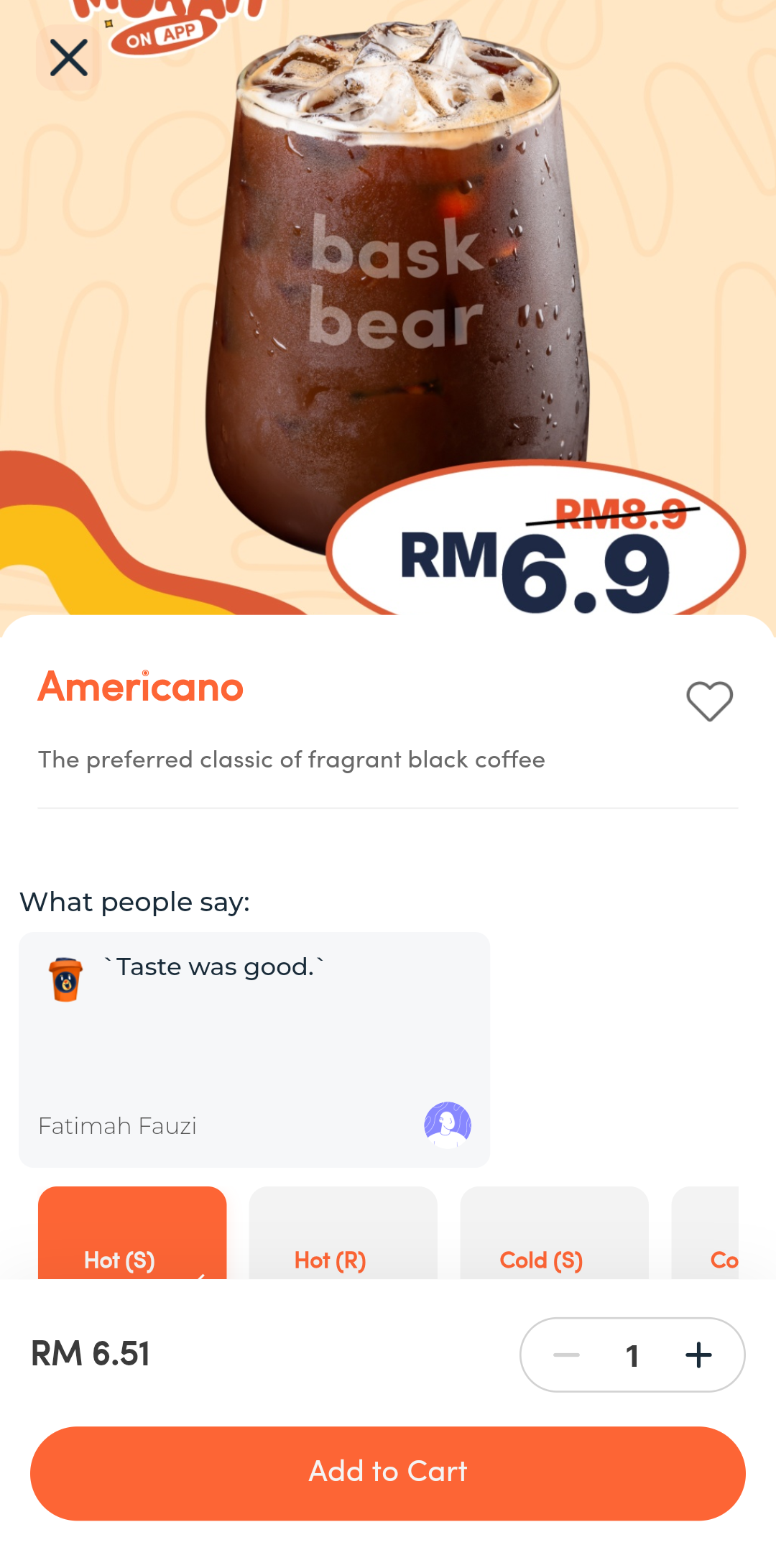
Item Details (Before)
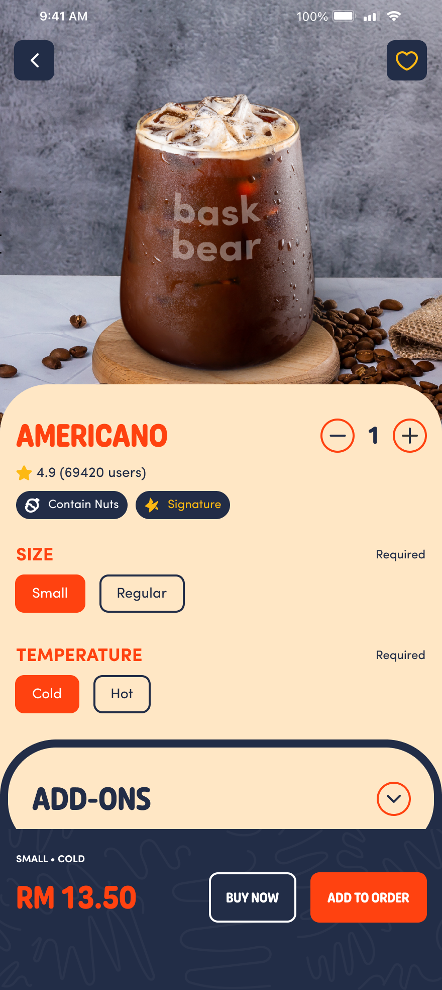
Item Details (After)
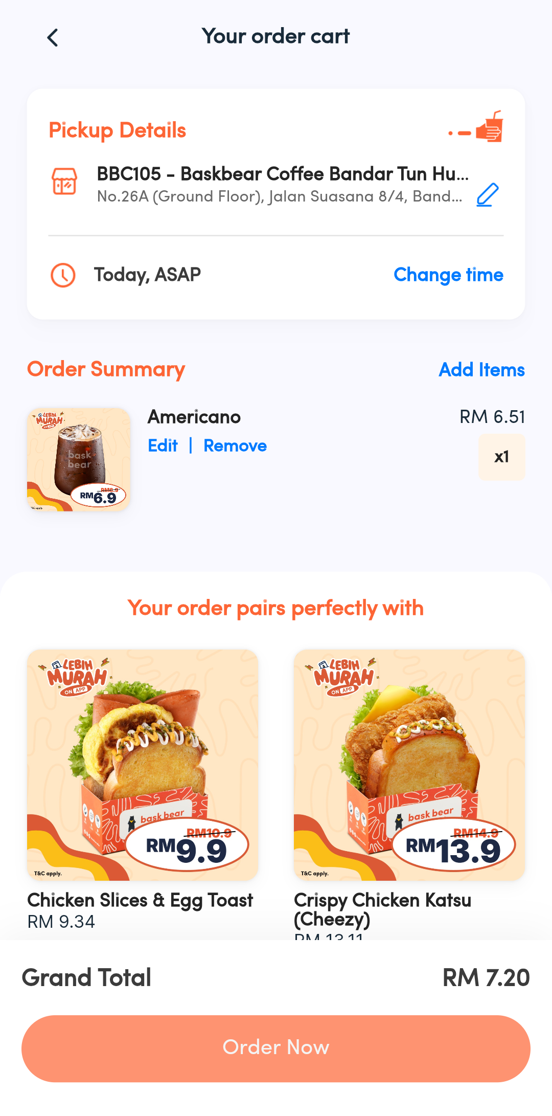
Order Cart (Before)
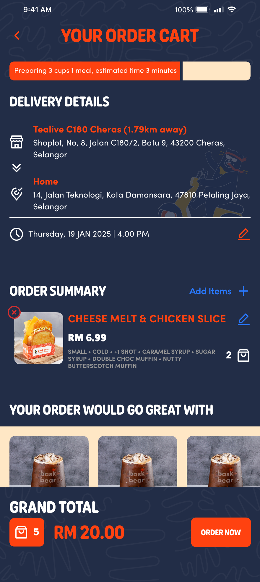
Order Cart (After)
Overview of New Bask bear coffee app design
Dynamic Category Availability Detection and Fallback Handling in Menu Navigation Flow
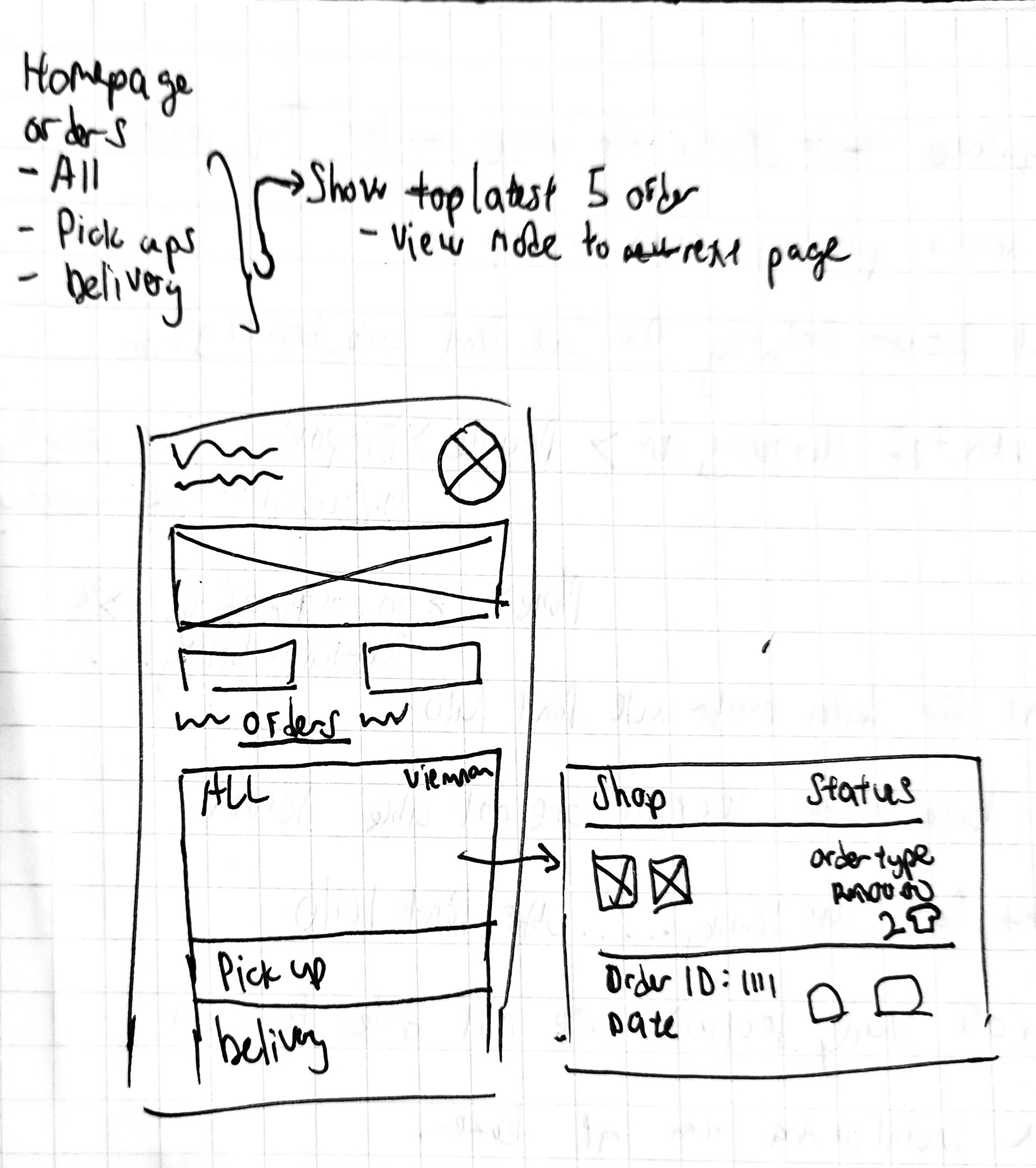
Mock-up and Sketches